Graphic design, illustration, visual identitySelected Works
Better Burger
Proworks Bottle
Jammed
RingRing
Ap-peeling Fruit Stickers
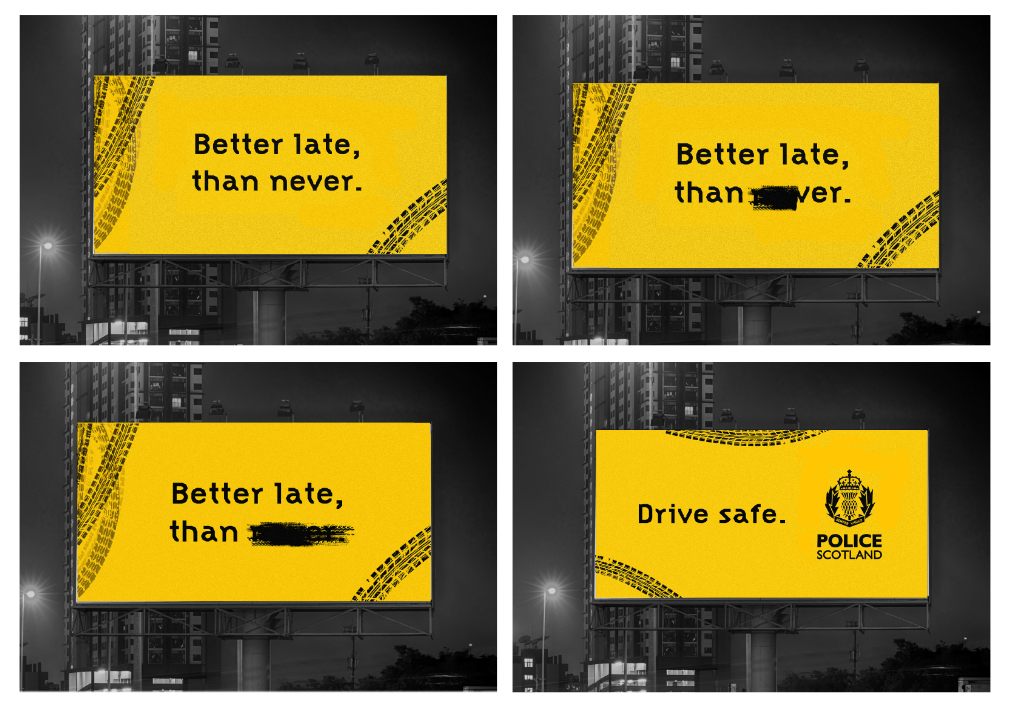
Better late than never
Better Burger
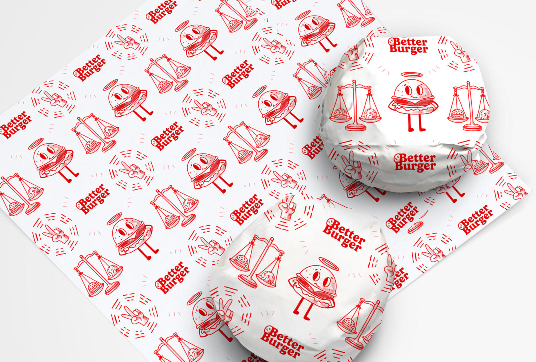
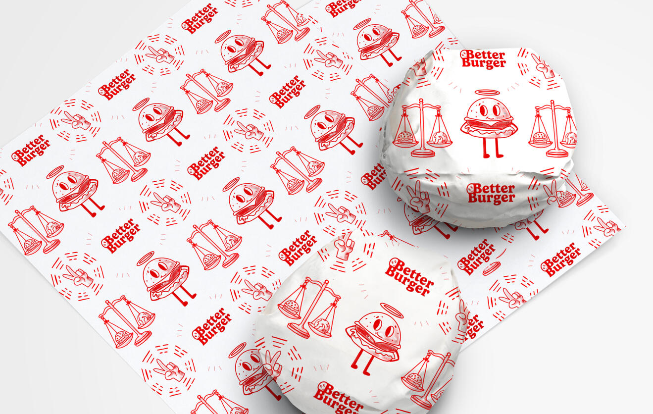
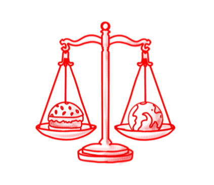
Better Burger - a brief from Moving Brands to design from themes picked out of a hat: lab grown meat and taoism.In an identity brief given by Moving Brands this began with a workshop where we were given a random philosophy and industry to create an unusual brand identity. I was given lab grown meat and Taoism. So I designed an identity for a food truck that can travel around and introduce more people to lab grown meat. As lab grown meat is still very new and people may be wary of it I focused on very friendly and playful branding. Although the meat is made in a new way, the burgers still taste the same way we all know and love - therefore there was a lot of influence from 50s diners for example with the red colour of the iconic booth seats.
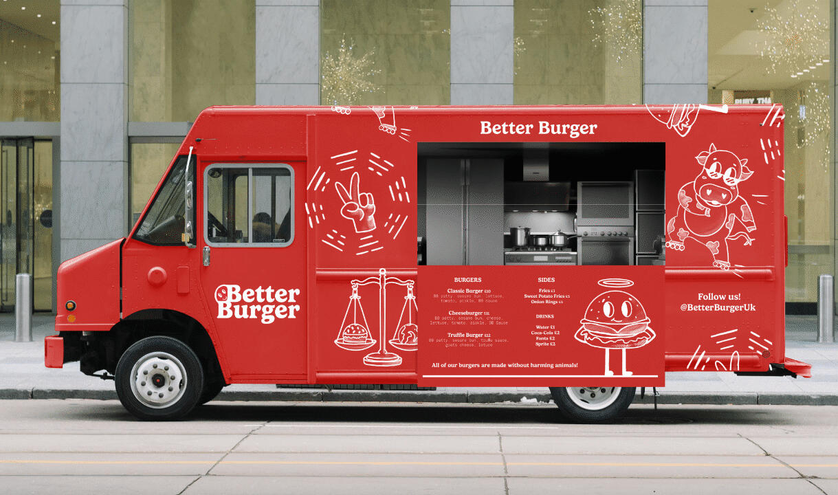
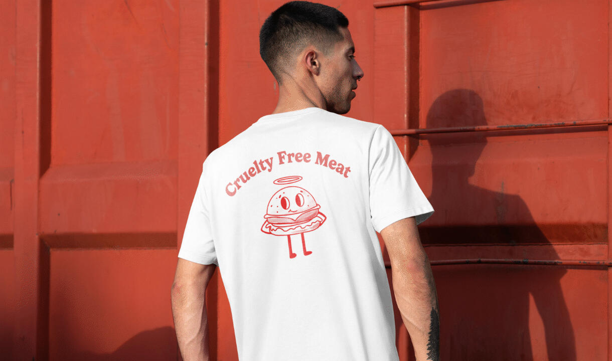
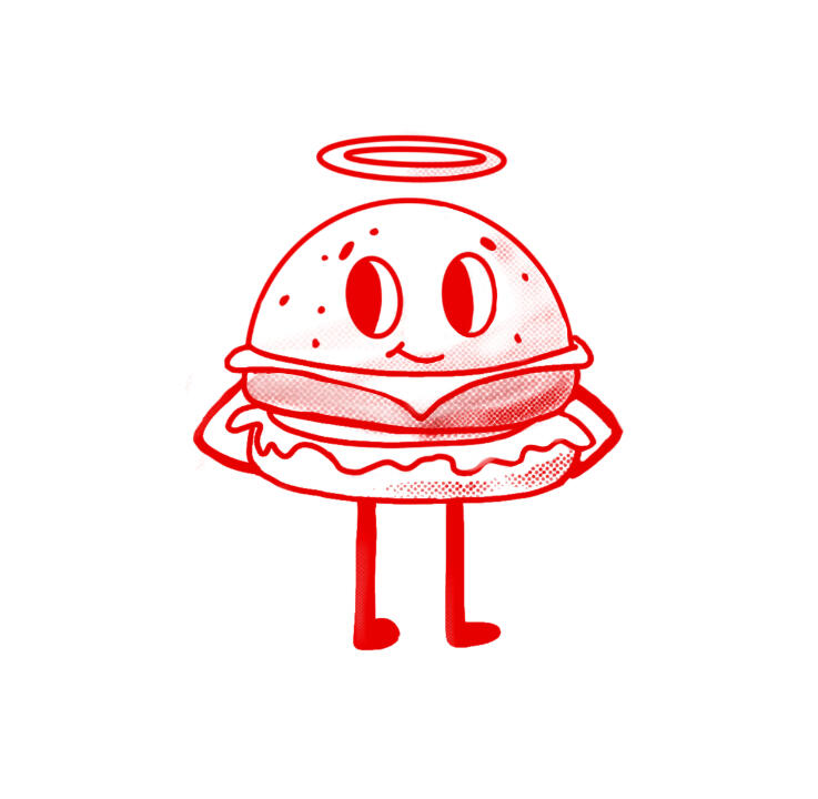
The name was well liked, being simple yet effective. Here shows the versatility of the negative space above the second B which can be filled by an image or drawing. I ended up deciding on the smiley face peeking out as it works well with the feel I want for the brand being playful and friendly.The typeface I chose is ‘Gelica Sans’, with a friendly feel with the rounded lines and a juicy thick look.Tying into the smiley face on the logo, I drew a burger with a the same face to be the mascot of sorts to appear on the uniform. With a halo to symbolise the goodness of the company and the ethical way the meat is made.
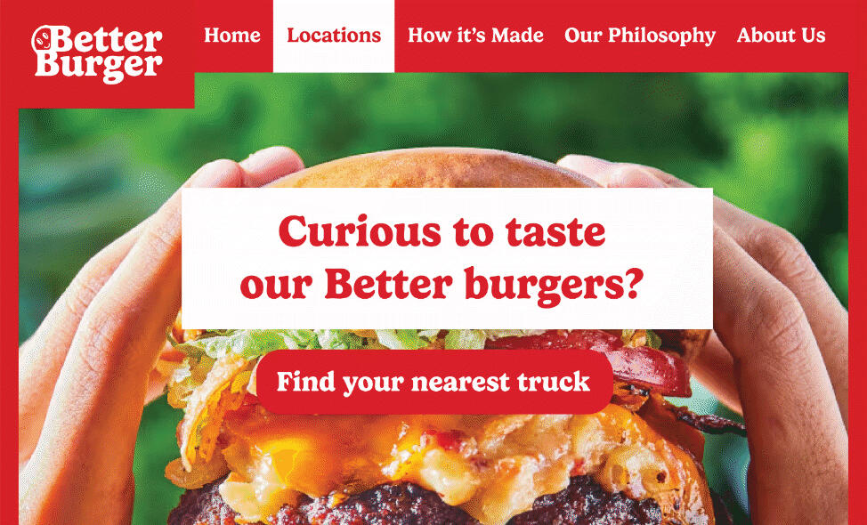
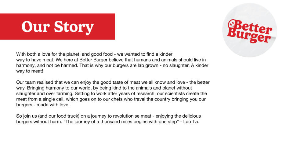
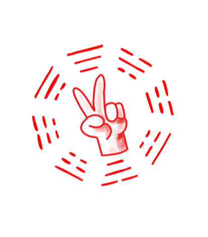
The illustrations are intended to feel retro, as the identity is meant to feel familiar, a reminder that this is still good old fashioned burger meat, just made in a better way. This burger has an onion ring halo, to further imply the goodness and purity of the brand.The lines on the outside are the Taoist symbol of Kua. These eight symbols represent different elements of nature - they are: fire, earth, mountain, water, wind, thunder, lake and heaven. Rather than the usual ying yang inside which would have been to obvious, I decided to modernise this with a peace sign.
RingRing
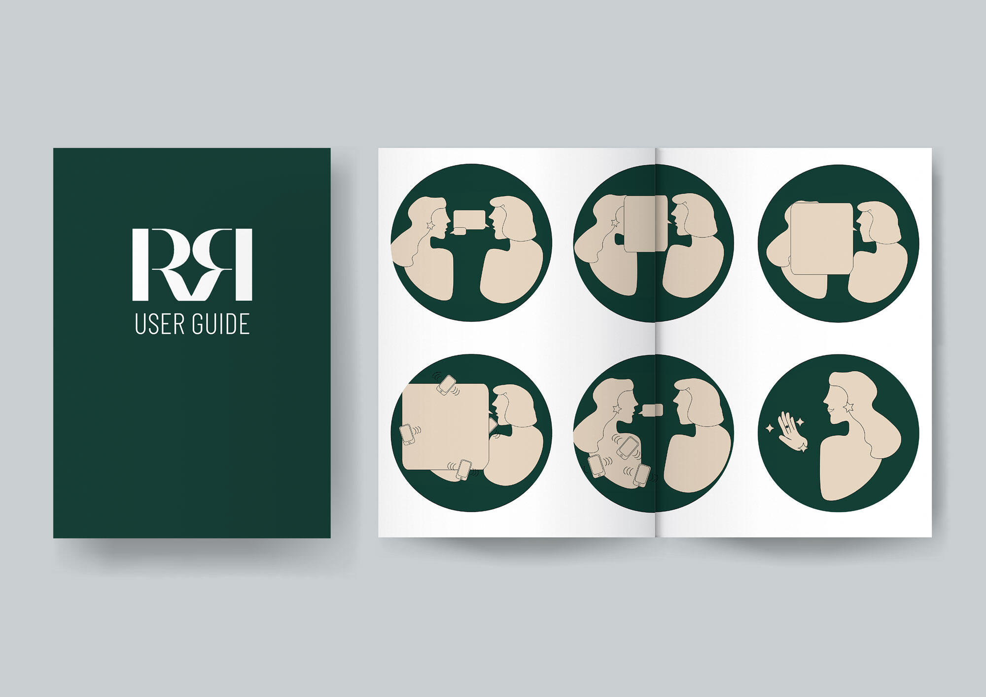
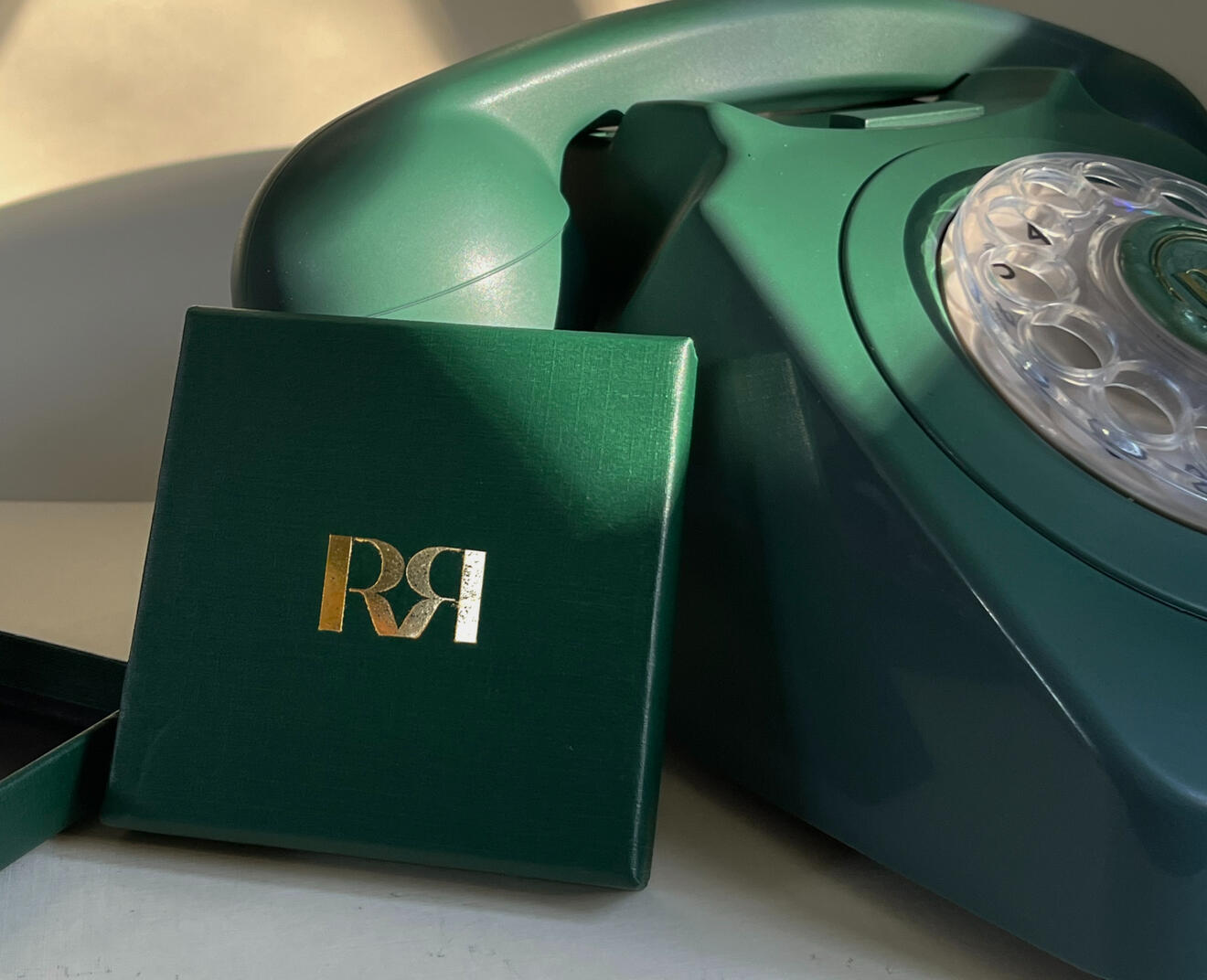
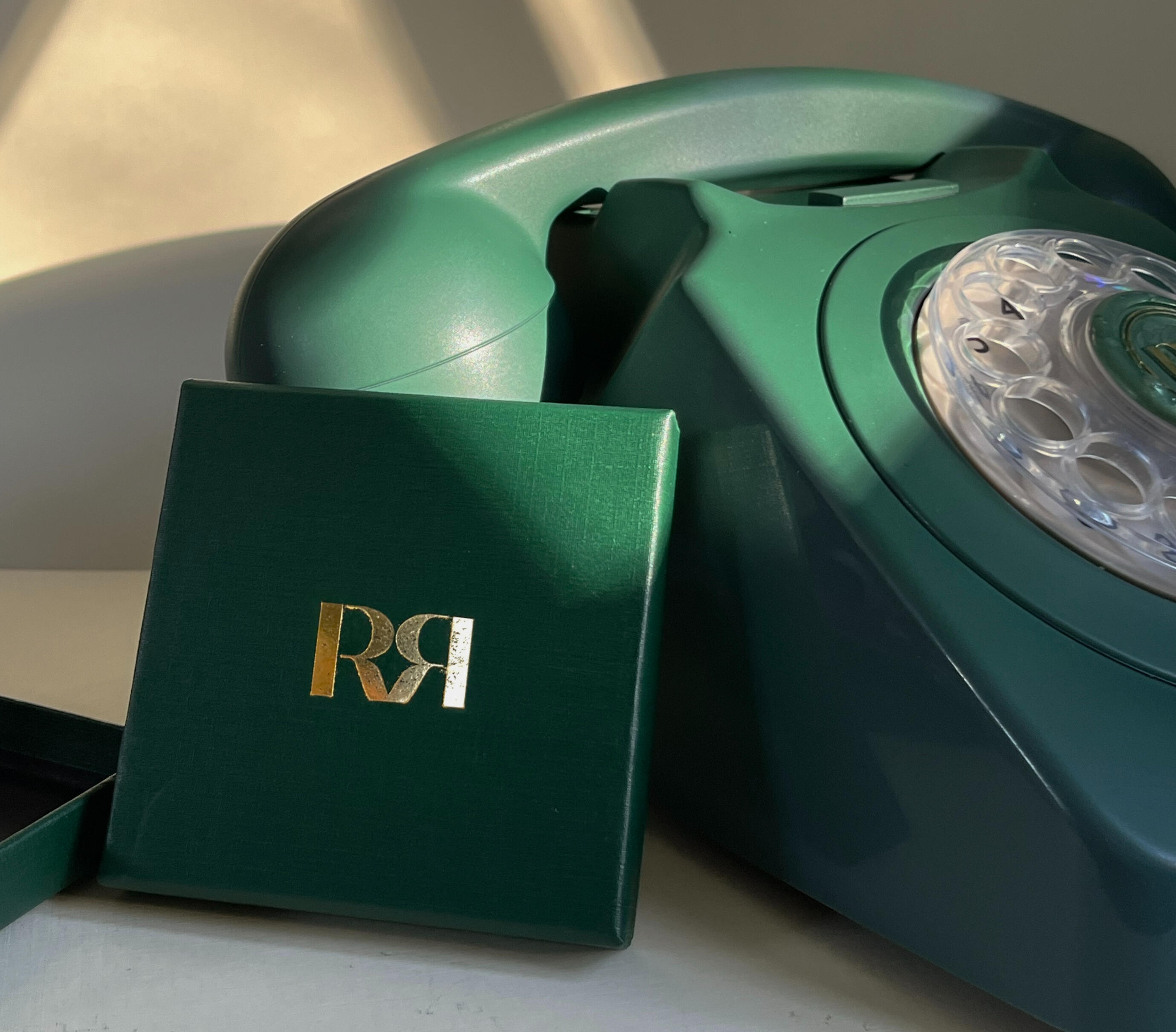
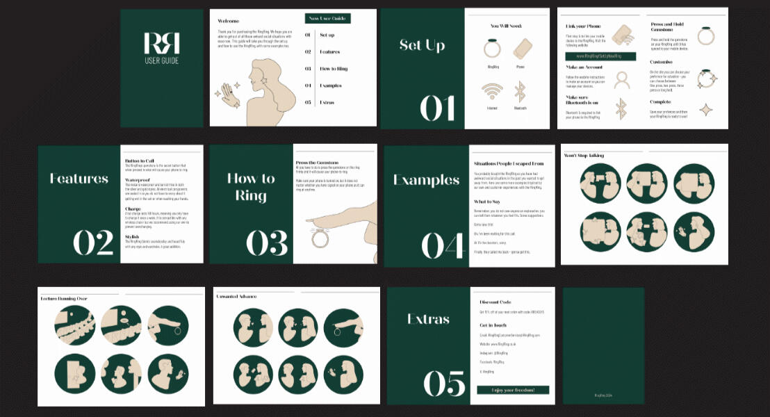
This project came from the weekly prompt that was ‘design a product that would help someone navigate a tricky social situation’.I was thinking about what tricky or awkward social situations I have been in myself and wished I had an easier escape. I had the idea when I remembered a time whilst waiting for the train a man sat next to me and started asking lots of personal questions even though I was on my phone trying to look busy. I felt uncomfortable so in the end lied and said I need to go get my ticket now and walked away.What if there was no easy way out like that – then I had the idea of faking a phone call. Activated by a ring.Vector illustrations created in Adobe illustrator.
My Proworks Bottles
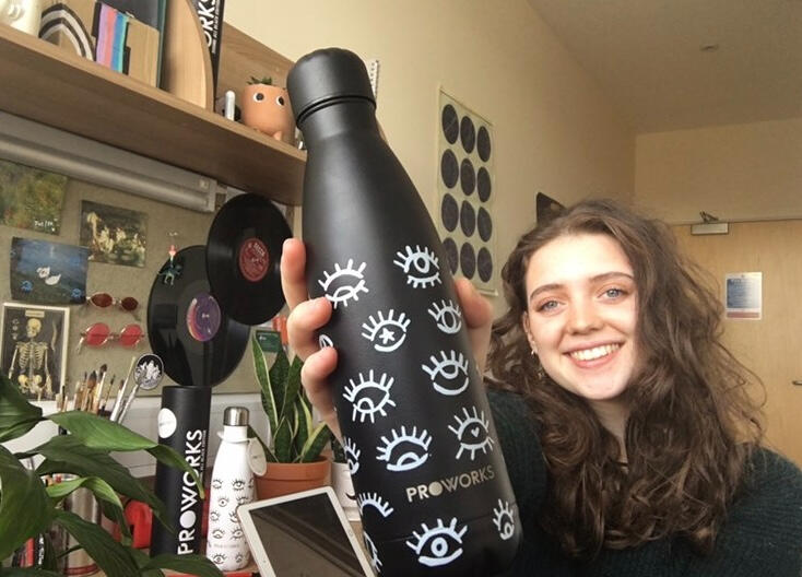
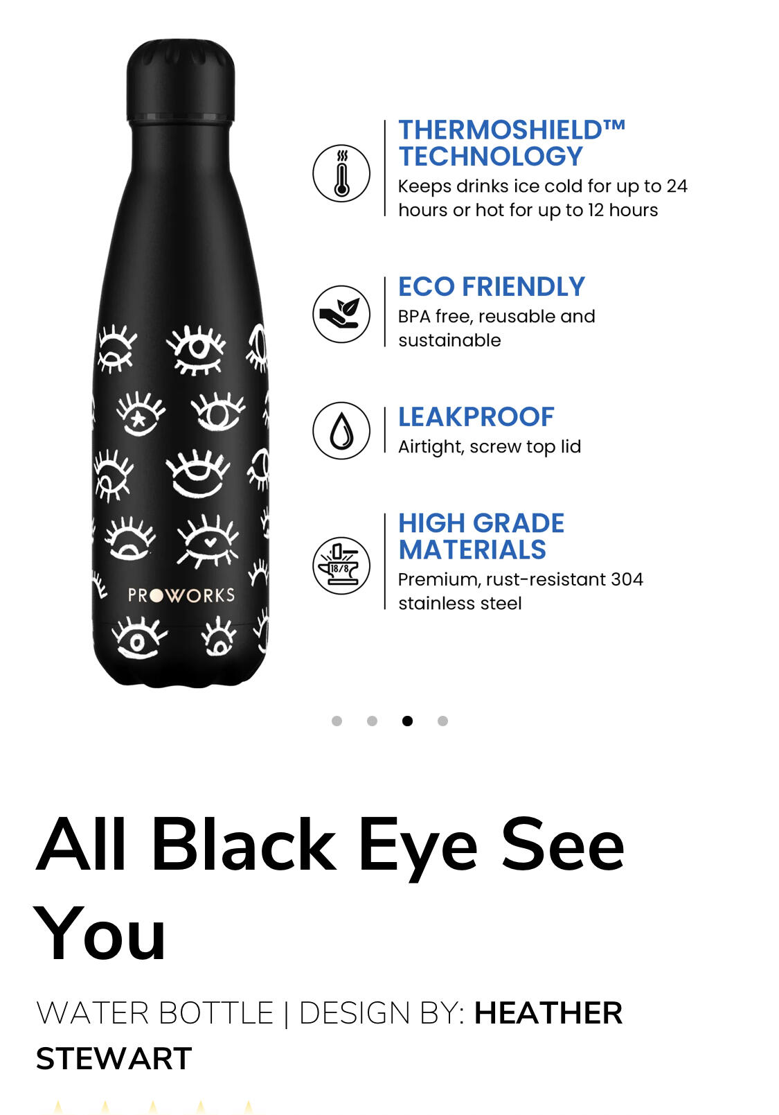
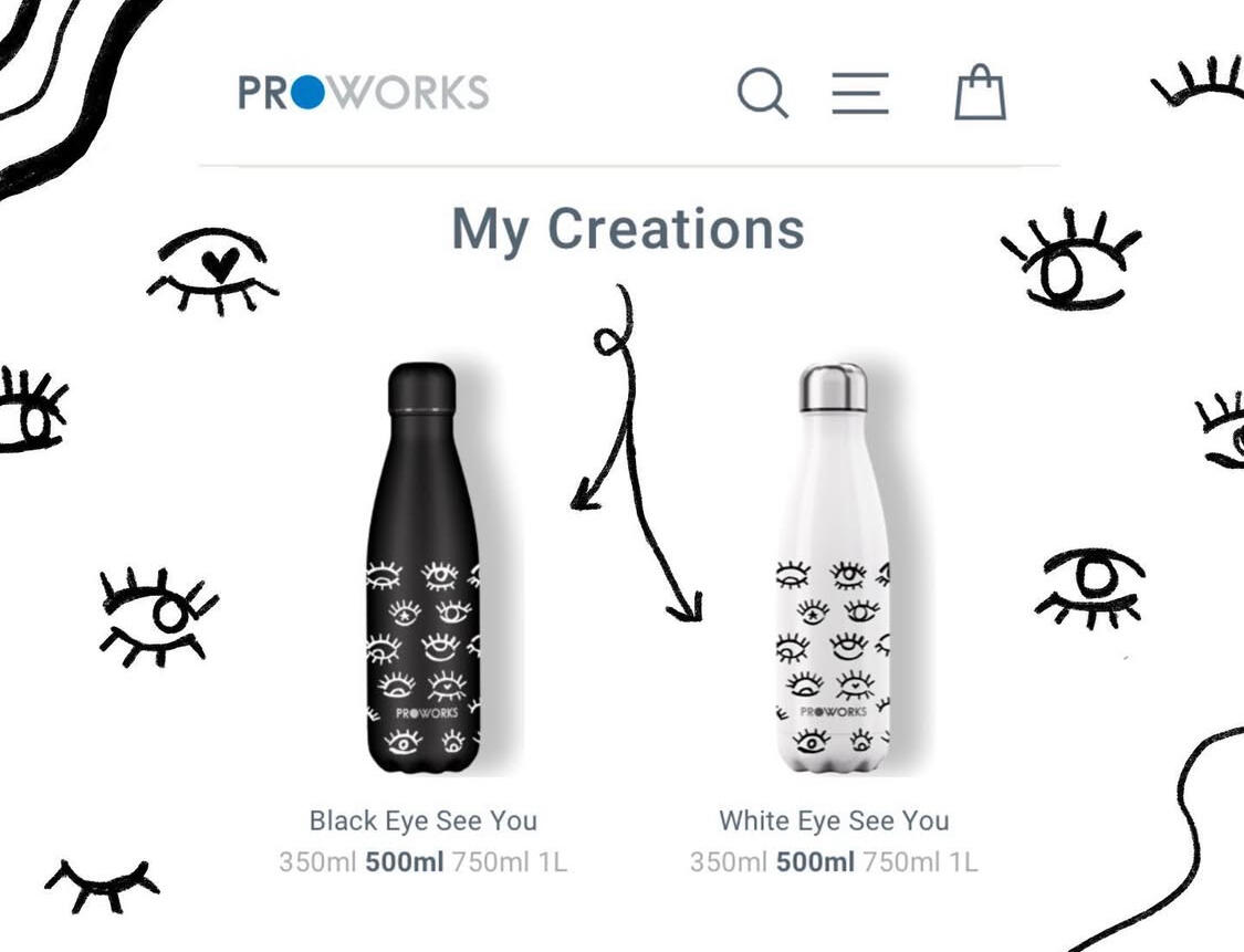
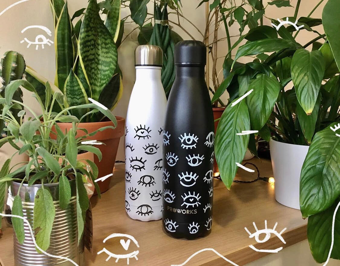
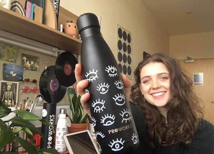
I was given an amazing opportunity to turn my bottle design into a reality with ProWorks. After drawing mock-ups, I then was given a template and guidelines which I took into photoshop and refined the design - making sure the quality was high for print and the pattern aligned. I chose a simple yet eye-catching design for a bottle that would be something I would want to use (and did)!
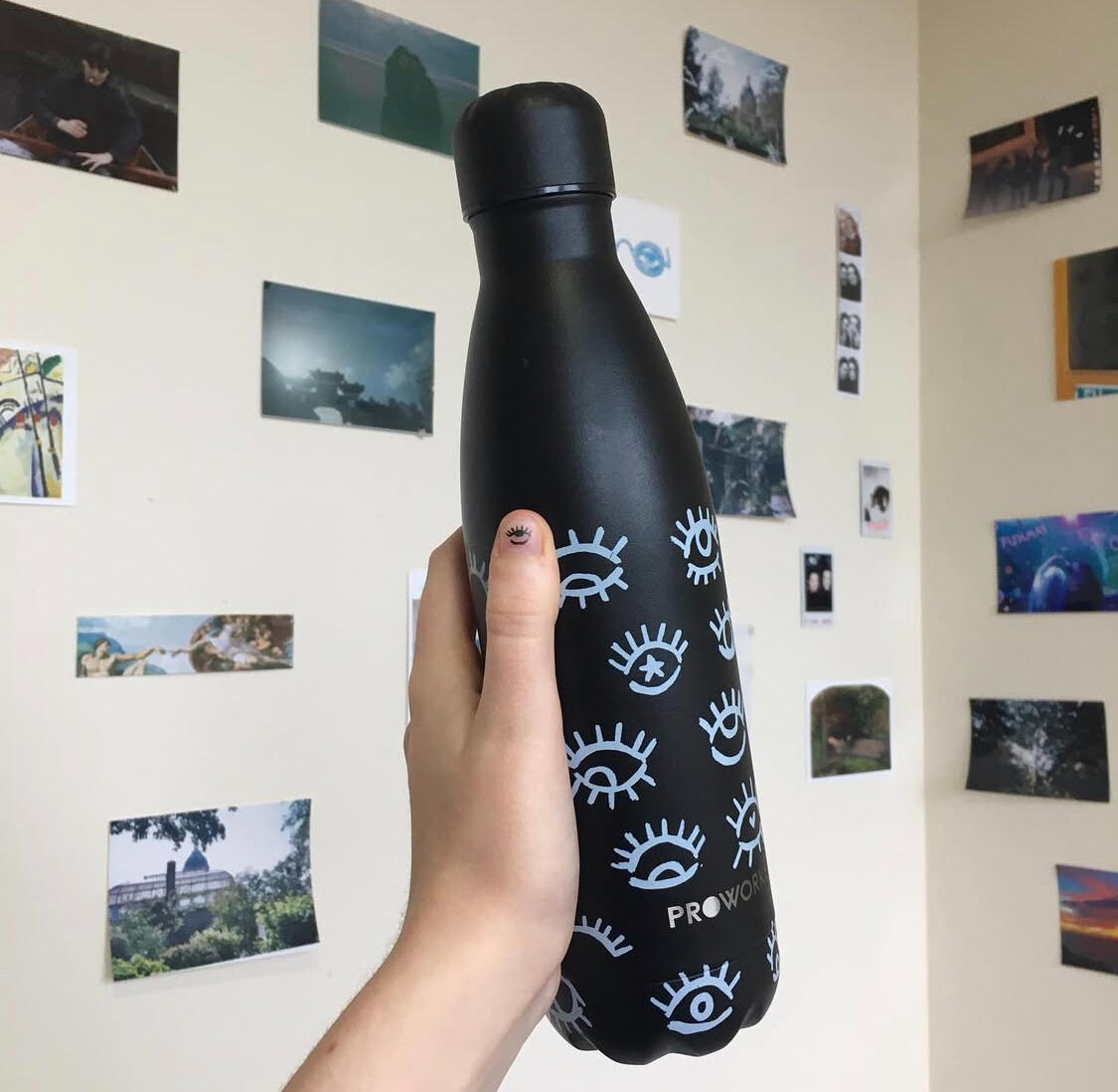
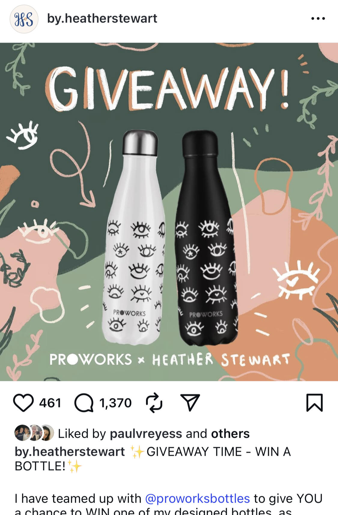
The company later decided to do a giveaway for these bottles which I was tasked with designing the post and posting this on social media. My first step was designing the layout - I decided to make the word 'giveaway' the focus alongside the bottles which would grab people's attention. I matched the design by using the same pencil-like brush and repeated the eyes to give it harmony.So the post's caption was clear to viewers I kept it simple and at the top stated that it was a giveaway and what they could win (as shown with the high qaulity images in the post itself). Buzz words were also capitalised such as 'win' to emphasise the giveaway if they skimmed over the text.The post ended up performing very well in a short time, with the entry requirements being to share with friends and post on your story. Therefore it got a lot of engagement, and hundreds of people were interested in getting their hands on the bottle. It was also a good experience to learn more about what makes a good social media post such being that an attactive design and clear instructions make people interested (not to mention free things)!
Ap-peeling Fruit Stickers
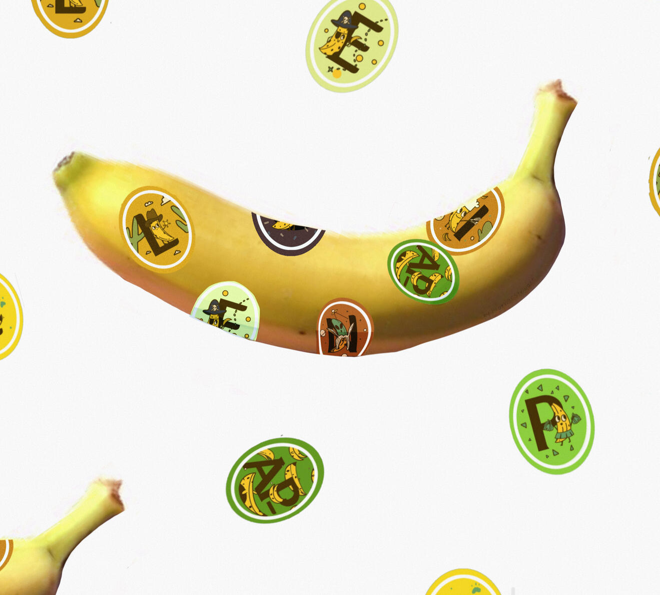
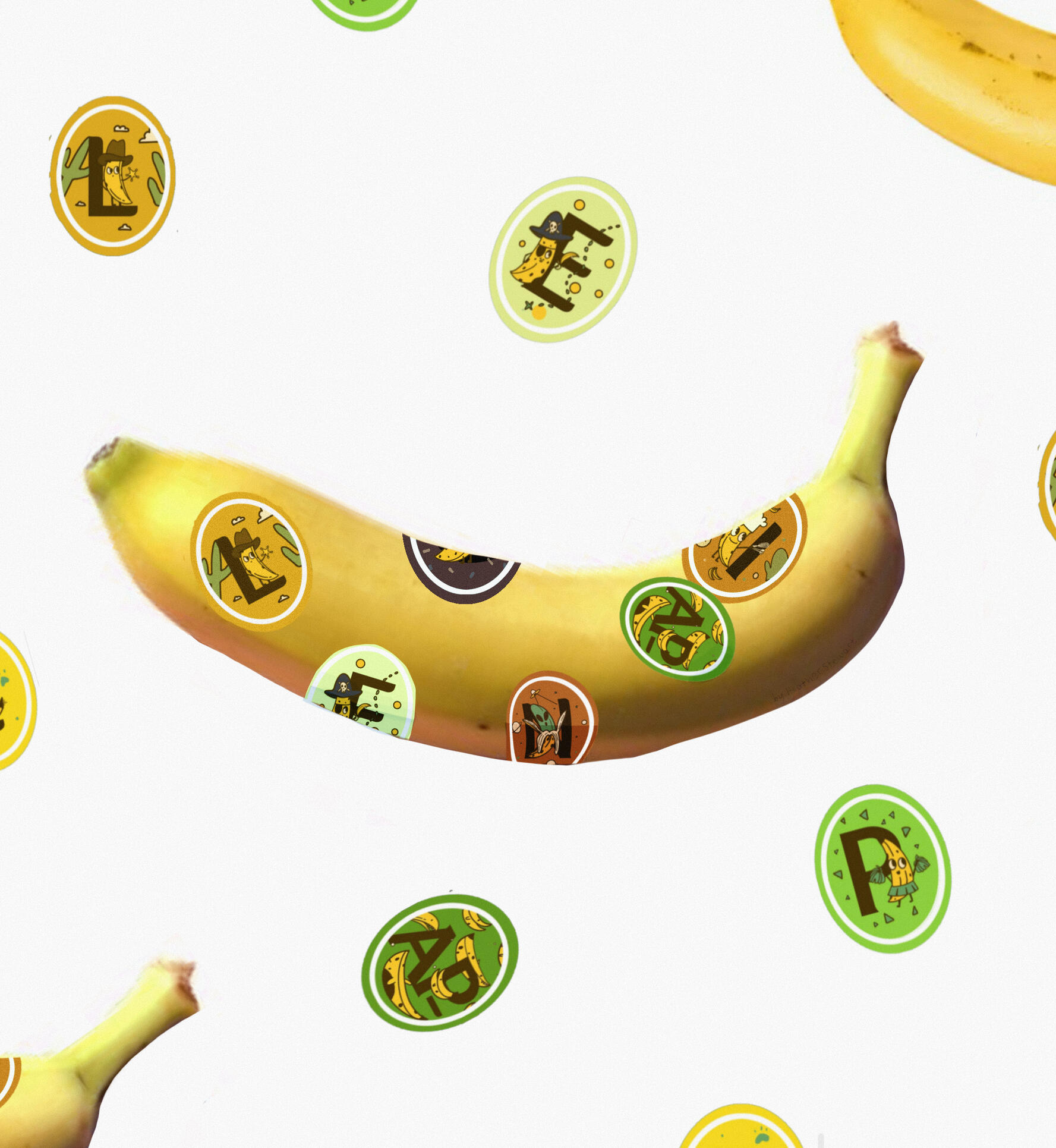
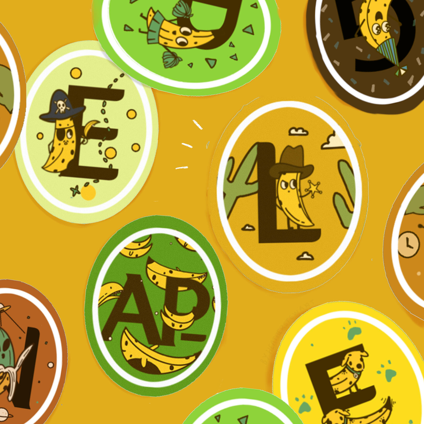
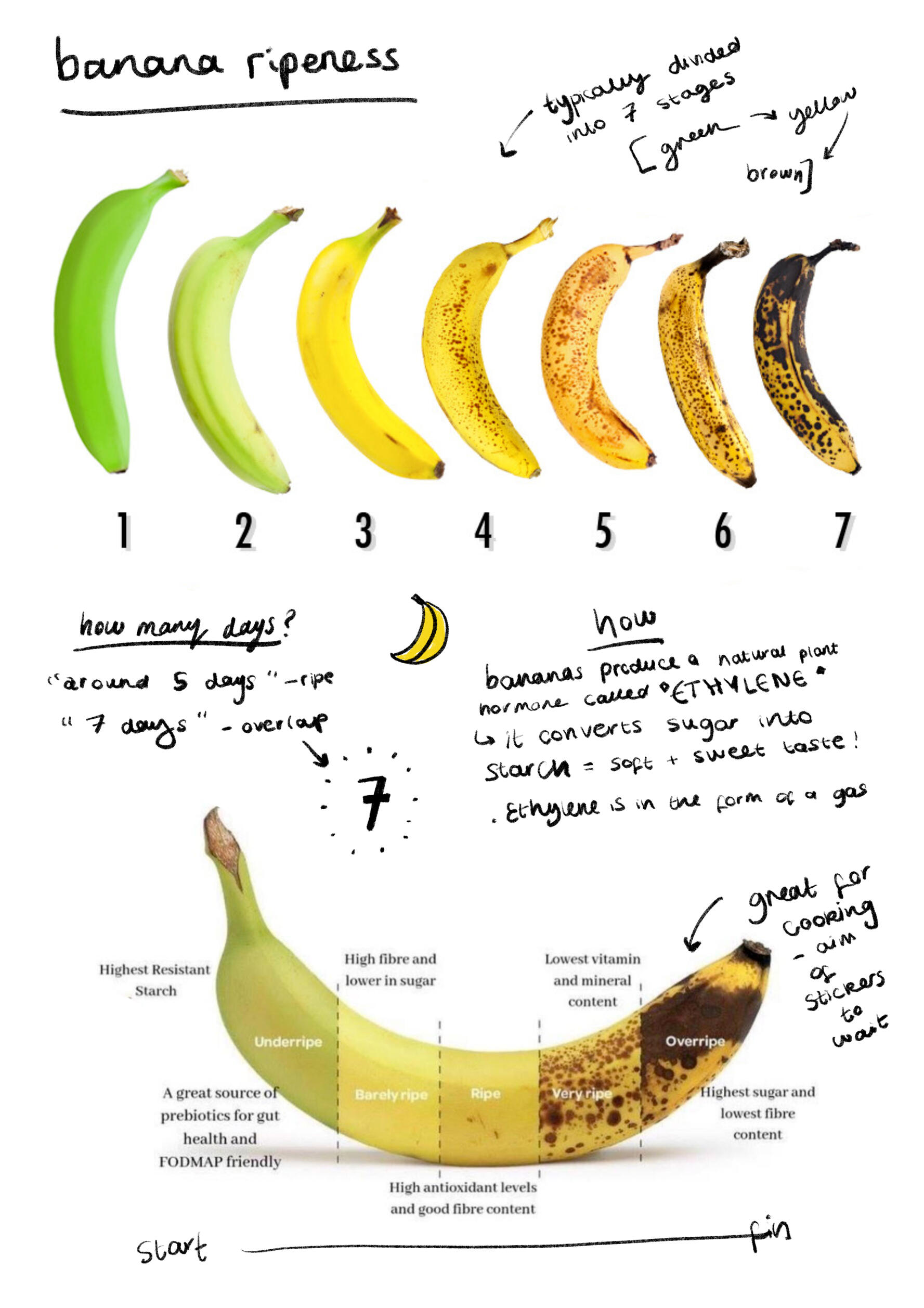
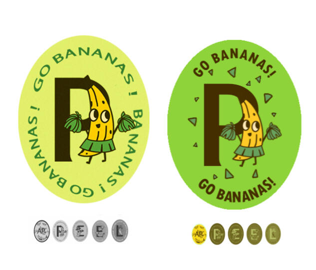
This was a brief from GSA, to create a new rewards system. I got the idea to create the award for patience when waiting for bananas to ripen, as my friend had recently made banana pancakes and I wanted to make some myself but had no overripe bananas to do so. My only choice was to wait for them to become sweetest and overripe.The colours of each stage I am thinking of corresponding to a badge or sticker to colour match it so you know when you gained the award.The reward system is recognising the patience and willpower people have when waiting for a banana to become overripe so it is at its sweetest to bake with and use in a recipe.My final outcome was banana characters and animals that are standing next to letters and they spell out ‘ap-peeling’. The small size of the fruit sticker was something I had to take into account as too much on the sticker would be too hard to read and cluttered. Colour was decided to be the colour the banana would change at the different stages of ripeness and when you can colour match that to the banana (hence why the white border is slightly inside surrounded by the colour). When it matches you can take it off and stick it wherever they want and eventually it will spell out the intended word.To further progress this project I would have liked the create many different words they would spell out and it would be more exciting and enticing to get as it is not the same word again and again.
Development
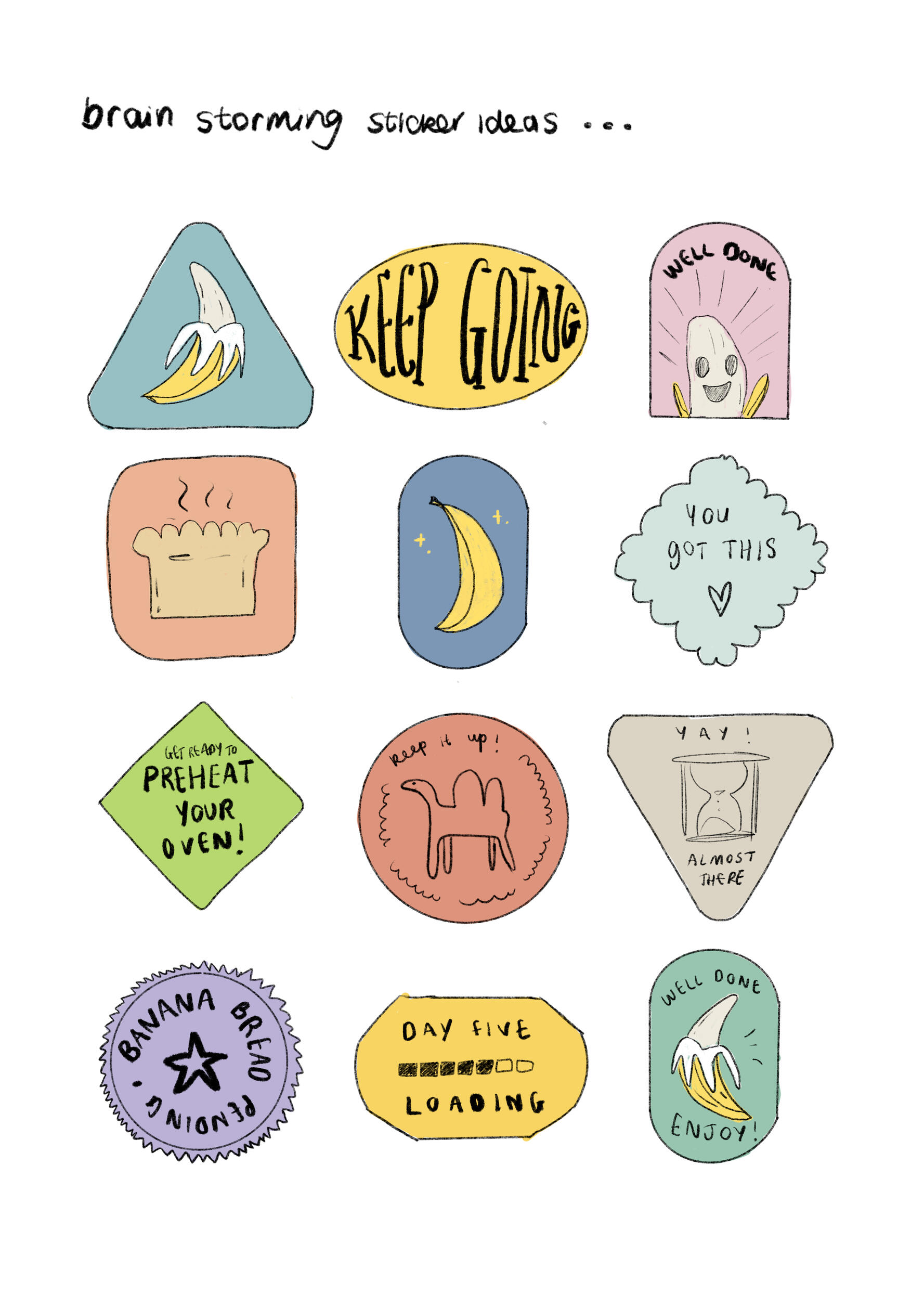
Some sketches showing my ideas for shapes of the fruit stickers being more creative and brainstorming how they might look. After researching symbols of patience for example there is a camel which I included in one. An hourglass also but that felt too ominous. The loading bar got good feedback as well as the banana sketch ones although I thought these were too obvious.I went and developed this theme further however and decided to make the bananas characters with costumes to make it more fun and unique. On the right is one of the first designs of a banana cheerleader. I tried adding words to the stickers depending on the characters going round the border. However after crating a few in different styles and fonts I realised it looked to cluttered and hard to read on the small size of a fruit sticker.
Jammed
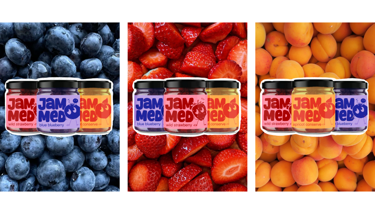
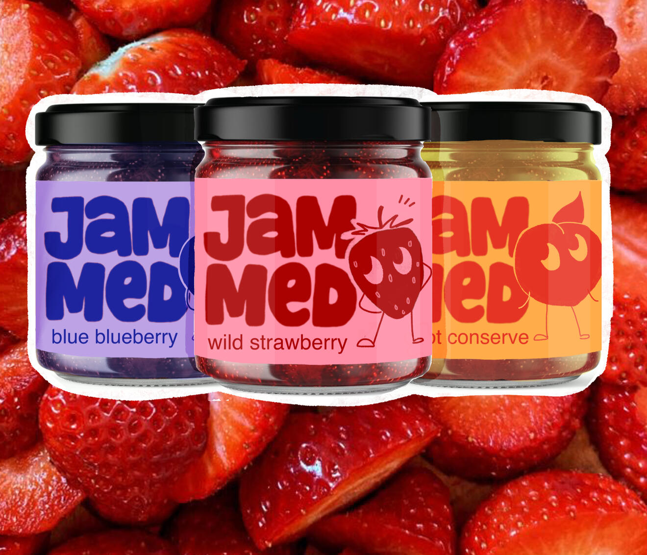
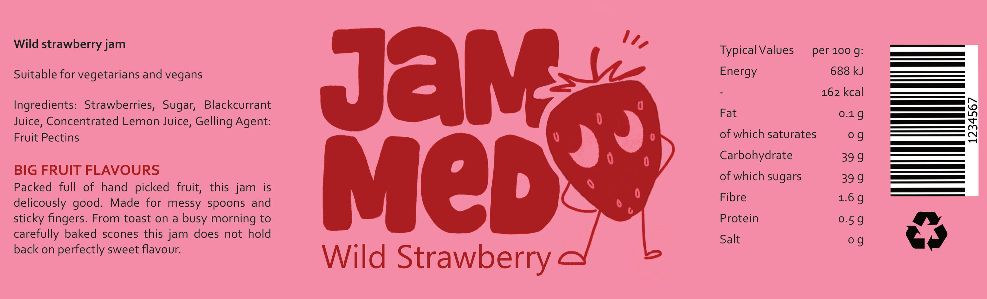
This was a week long project with the deliverables being branding and packaging. Jammed is a bold jam brand with big fruit flavours and packaging that stands out on the shelf. Just usual jam with a lot more character. Bold, loud. fruity, playful. To achieve this feel I chose a bold typeface and customised this so the other vowel to lowercase to make it consistent. I chose to add a character to distinguish the brand further as most jams do not have one on the jar.
BGL
Mind & Melody
Better late than never
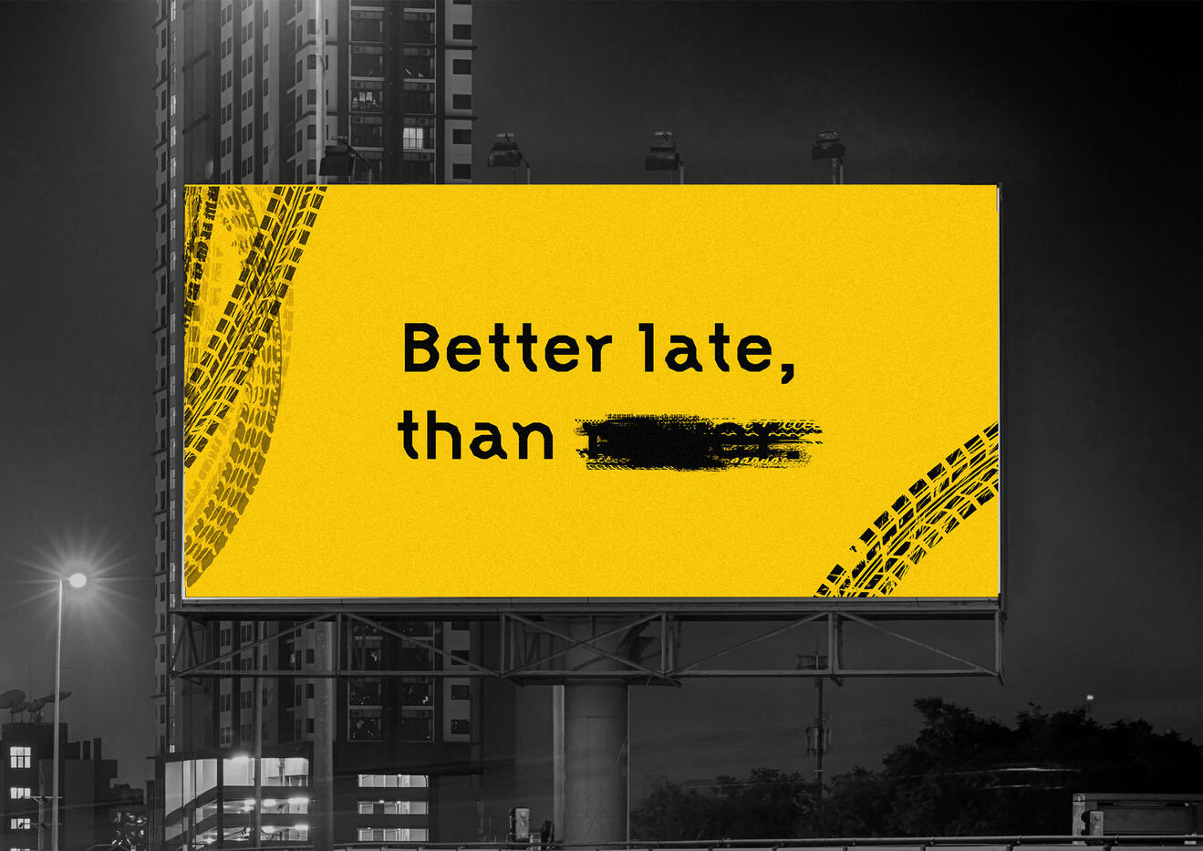
To takeover a billboard for a day. This brief focused on the relationship between audience, location and the message. I chose the message better late than never and the M8 as even though restrictions have been put in place there are still a high volume of accidents.I was greatly influenced by road signs and motorway information signs for the style of this project. The colours I chose at first were based off of double yellow lines on the road, and also befitting the colours of the LED road signs. This is because I wanted the sign to clearly be about road and road safety, and also these colours are very bold and eye-catching.Created in Adobe Premier Pro.
Others


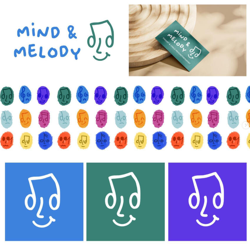
Mind & Melody
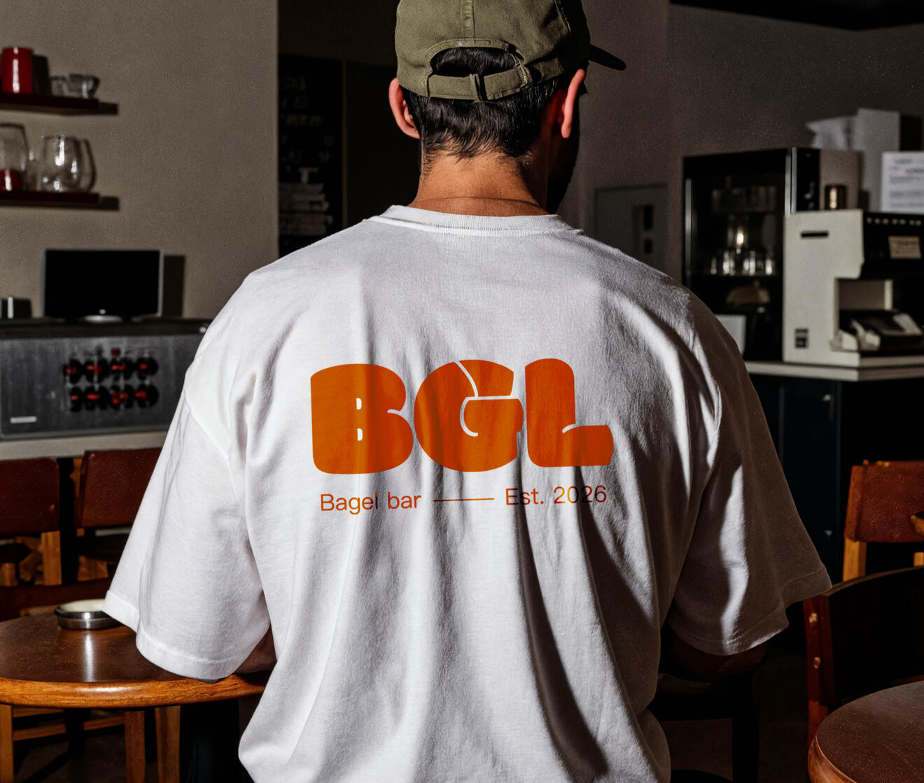
BGL
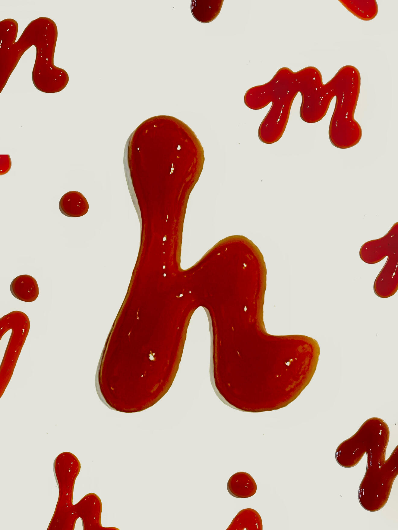
Sriracha Source